Minimalist Wordpress Templates

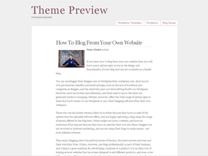
PressPurple Wordpress Template
|
Presspurple is a beautiful and simple one column wordpress theme. It has no sidebar, just the page links on top of the main content area. It displays latest 10 articles one by one. The wp theme design is as minimalistic as it gets. The theme has a light gray background, white main area, black text and purple text links. This wordpress template was designed by mycreativebits.com |

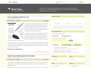
Professional Business Wordpress Template
|
Professional Business wordpress theme is an elegant and clean 3 column wordpress design. Main content area is on the left side, small black text on white background. Pages menu is above the header – on the left side, while the search function is on the right side. This wordpress template includes great detail like small icons for repeating links, etc. The sidebars are located on the right side. On top there is a place for sponsor ads, RSS subscription form and recent posts, comments, etc. The middle sidebar supports wordpress widgets. Professional Business wordpress template was designed by Elad Domb. |

Plainscape Wordpress Template
|
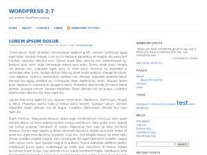
Plainscape, is a wordpress theme is premeditated by Srini G. As the name itself suggests Plainscape is a clear and lucid appearing template. This theme seems very neat and pacific due to the white backdrop. The black and blue colored fonts on this template seem very classy as well as professional. The header is in unambiguous blue, bold and outsized fonts. Navigation bar in inclusive of six titles that link essential pages. A sharp edged search area looks very suitable on the theme page. It is a two columned fixed width theme consisting of a side bar and content area. All the relevant and useful information is unequivocally mentioned on the main page that would definitely prove very aiding for the reader. |

WordPress Original Wordpress Template
|
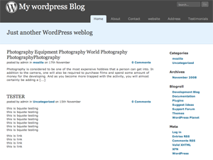
A two columned theme with a design similar to the original wordpress theme named as wordpress.org. The theme has a large header with two different color schemes of dark grey and light blue. The header features a traditional navigation bar that displays the various categories included in the website and a unique search area in the top right corner. The content area and the sidebar of the theme has a simple white base with blue and black colored fonts that makes the theme look simply authentic and sober. The sidebar has black colored sidebar titles with blue colored links to the information displayed in the website. |

Silent Crystal Wordpress Template
|
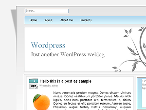
Silent Crystal wordpress theme is a simple, minimalist and beautiful WP design. The design is mostly white and pure css. Only the header contains some graphic – gray plants, sort of an elegant, minimalistic art. On the right side of the grass there is the blog title and tagline. Above it is the pages menu. This is a 3 column wordpress skin with main content area located on the left side and two sidebars on the right. The sidebars are conjoined on top and show a menu where people can click on recent posts, recent comments and archives. Below that there are two placeholders for advertisment banners (125 x 125 pixels). The sidebars support wordpress widgets. Silent Crystal wordpress template was designed by Italiaqui. |

Orange Techno Wordpress Template
|
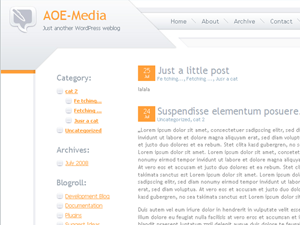
Orange Techno is an amazing technology oriented wordpress template. The WP design is futuristic and minimalist where the main content area is white and sidebar has striking orange links. The sidebar is located on the right hand side and it includes all the standard wordpress theme links. Pages links are in the header graphic which also contains a logo and blog title in the upper left corner. Orange Techno wordpress skin was designed by AOEmedia.de |

Eliba Wordpress Template
|
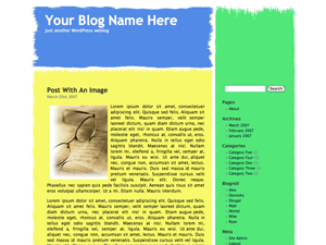
Eliba wordpress theme is a very simple wp design. The template basically looks like somebody made 3 swabs with a paintbrush. The header swab is blue and contains the blog’s title and sub title. The main content area swab is yellow (blog post text is black and so are the post titles). Then the sidebar swab is green and possitioned on the right side. Eliba wordpress template was designed by Michael Heilmann and is perfect for anyone who’s into minimalist, clean and simple blog design. |

Fauna Wordpress Template
|
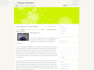
Fauna wordpress theme is a simple, clean and minimalist wordpress design. The theme is mostly white with configurable header graphic (3 colors are available; fluorescent green, red and blue). The main site background contains some minimalist thin line shapes towards the but it’s pure white from the middle down. This is a two column wordpress template with the widgets enabled sidebar possitioned on the right side. Fauna wordpress template was designed by Joen Assmusen and is well suited for anyone who likes their design simple and elegant. Installation instructions:
|

Monotech Wordpress Template
|
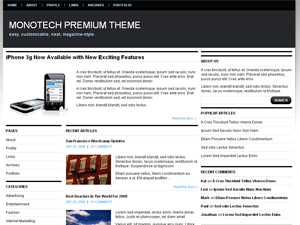
Monotech wordpress template is a clean and minimalist, but not simple wp design. There are only 3 colors prevailing, white, black and baby blue (links). The header is black with pages links on top and blog tile in the center left. The main content area is white and located between two sidebars. Both sidebars are wordpress widgets compliant. The right sidebar contains a google adsense placeholder which by default points to public service ads by Google. Monotech wordpress theme was designed by Chiq. |

Pink Bird Wordpress Template
|
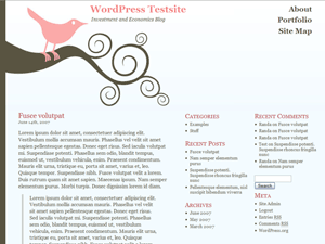
Pinkbird wordpress theme is a simple, clean and elegant wordpress design. It is really minimalist with only one image of a pink bird sitting on a curved branch. The rest of the page is pure white. This is a 3 column wordpress theme. The main content area is placed on the left side while the two sidebars are on the right. The middle sidebar is wordpress widgets compliant. Pink Bird wordpress template was designed by Randa Clay. If you’d rather change this theme to work fit in 800×600 browsers, it’s easy – just follow the directions in the Stylesheet file. Any repeating vertical background image will work with this theme. To change the background image, simply upload the image you’d like to use to the images directory of the theme. Then, find this piece of CSS near the top of the Stylesheet file: and change ‘background.gif’ to the name of the image file you’d like to use. We recommend you don’t use one that is too wide if it is very dark, as the transparency effect will cause the text in your posts to be difficult to read. |

